Hello ladies and gentlemen
Tonight we shall have a diffrent sort of bit of content. as you see most of you are american, and in america oblivion isnt out yet, so without further ado lets have our spolier free review!
Right first of all im going to say this. TRY TO NOT WATCH ANY TRAILERS AT ALL. really it can ruin it.
so a basic (spoiler free synopsis) is that Jack Harper(Tom Cruise) and Victoria Oslen (
Andrea Riseborough) are the only 2 humans left on earth. As it is the year 2070 and humanity is reeling from the aftermath of a war with aliens (known as scavangers), and during its closing days humanity deployed nukes, turning the world into a desolate wasteland, and humanity is leaving for the stars on a giant space station. Harper and Oslen are left to make sure that the generators sucking water from the oceans are still functional and are protected and that the drones are functioning.
 |
| Harper encounters some scavengers whilst fixing a drone, it must be noted that for a large part you never properly see a scavanger, which is intruiging and makes it a much more tense film. |
So right off the bat, wow the effects are beautiful, the white shine of the drones off the wasteland, and the sci-fi tech all looks beautiful, and combined with some stunning camerawork it does look fantastic, and especially later on in the film the lighting really shines and looks beautiful, especially when coupled with the aliens eye glows.
The plot is definetly great, but not ground breaking, a fantastic and intruging reval makes the 2nd half very enjoyable , but the first half may or may not be to your taste.
However the locations are where this film really shines, ruined football pitches, a fantastic gloomy library interior is really a high point early on, and the Interior of the base in the 2nd half is quite spectacular.
The acting is brilliant as well, with Tom cruises charismatic eagerness really shining as well as
Andrea Riseborough for provinding possibly the most intresting sci-fi character that ive seen in quite a long time. several other notable actors appear later on , however im not naming names as it was one of the high points of the film when they appeared to me, what i must say though is that their acting is fantastic, and the more senior ones is really stunning towards the end.
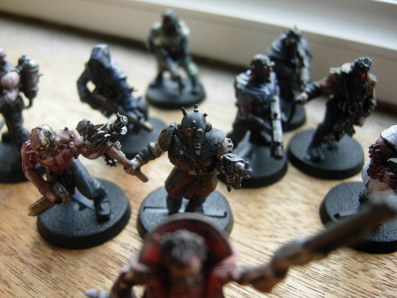
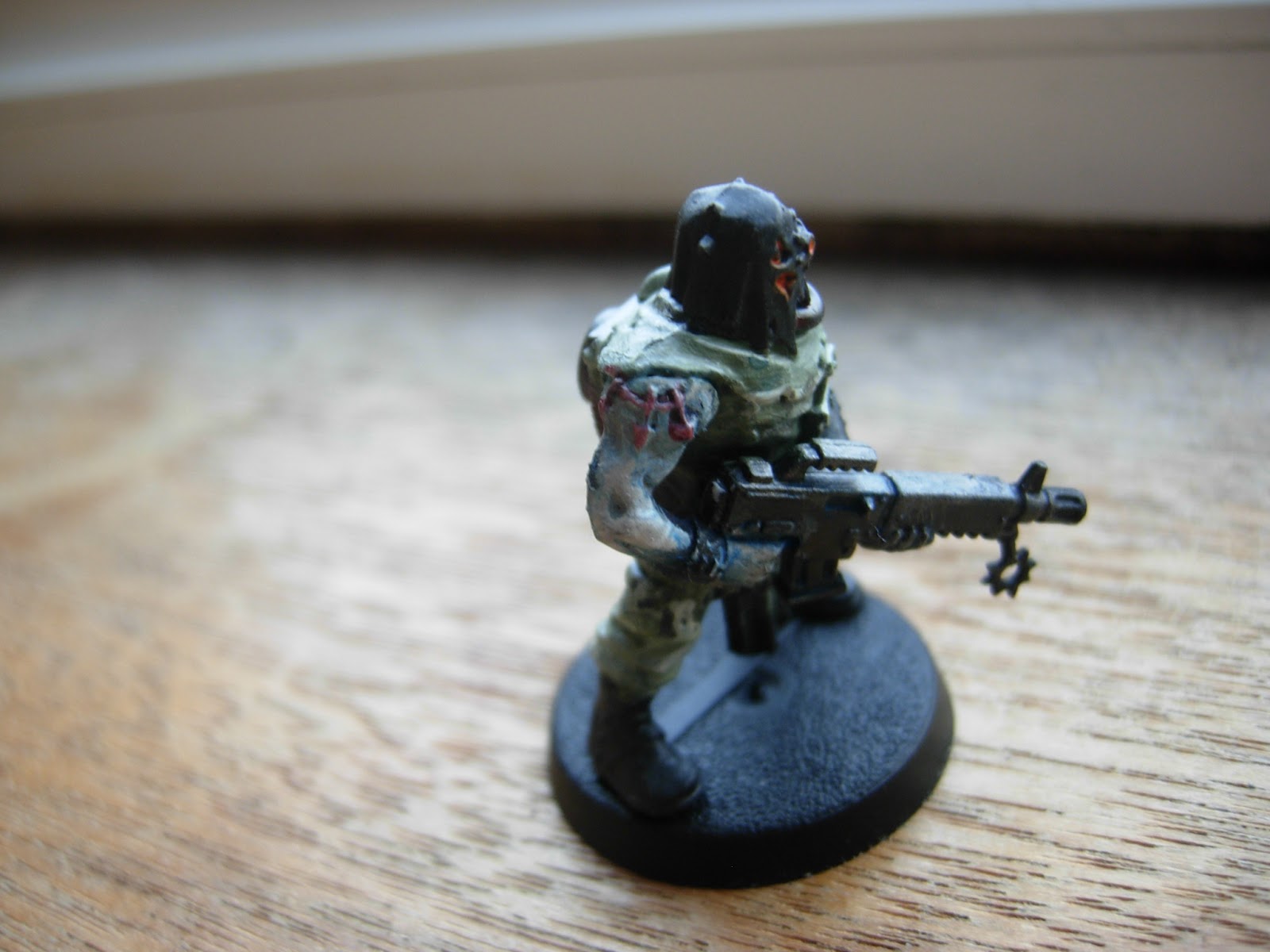
Another Item for which this film deserves prais for is the art direction, the scavangers equipment and helmets is a perfect contrast to the sleek and otherworldy technology of Harper.
Thankfully this film also steers clear of many sci-fi tropes.
 |
| Harper and Victoria's giant house in the sky. in the foreground is Harpers VTOL craft. |
All in all if you want a Film thats intreguing, a pleasure to watch and is a change from what most other modern films are; this film is for you. If you like sci-fi (and this is 40k blog, of course you like sci-fi!) this is for you. This film might not be for people who want some sort of chick flick, (or it might be, there are a lot of emotions and stuffs.)
I would thoroughly recommend this film to anyone, As whilst it wasnt the most Thought-provoking (although it was mildly deep, and was by no means shallow), it was a pleasure to watch.
so go watch it, just dont look at posters and trailers.
Because (highlight for spoiler) (I didnt know Mr.Freeman was in it, and seeing him appear was fantastic, the same goes for nikolage Coster Waldau (Jaime lanister from a game of thrones))
-fuzz